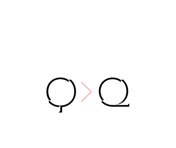
Alternate Q letter shape for ultra narrow line heights.
Implemented both as Stylistic Set n°1 (ss01) and Stylistic Alternate (salt) to maximize compatibility between applications.


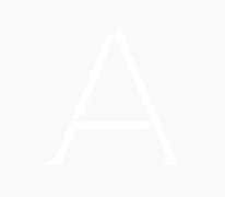
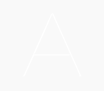
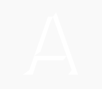
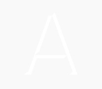
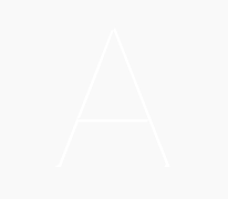
Novecento Carved is a minimalist and easy-to-use layered font family.
It must be paired with Novecento Sans, used as base layer.
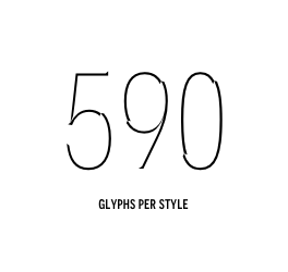
Each glyph of each style of Novecento Carved (around 18.000) was manually reviewed and adjusted after the first interpolation.
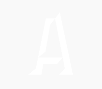
Of course Novecento Carved fully covers Novecento Sans glyphs in its 32 styles, including its Opentype features too. As the base layer –Novecento Sans– was designed as a stand alone project at first, you can create layouts where only few words are layered. The non-layered text will compose nicely (unlike most of the current layered fonts where the base font is too geometric and visually unbalanced).
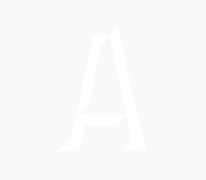
You can achieve a bas-relief or engraving effect just making the colour of Novecento Carved darker or brighter then its background.
You can also use Novecento Carved as a mask on patterns and visuals to make your texts more creative. This font is available for licensing in opentype and webfont format, as well as for mobile apps, ebooks and for software embedding.
Pssst: Novecento Carved keeps same vertical metrics as Novecento Sans, even in Photoshop where’s usually a headhake.
Novecento Sans fonts are sold separately.


| Ultrabold | Bold | Demibold | Medium | Normal | Book | Light | Ultralight | |
|---|---|---|---|---|---|---|---|---|
| wide |  |
 |
 |
 |
 |
 |
 |
 |
| regular |  |
 |
 |
 |
 |
 |
 |
 |
| narrow | 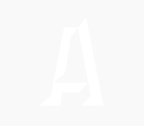 |
 |
 |
 |
 |
 |
 |
 |
| consensed |  |
 |
 |
 |
 |
 |
 |
 |
 Alternate Q (ss01) Alternate Q letter shape for ultra narrow line heights.
Implemented both as Stylistic Set n°1 (ss01) and Stylistic Alternate (salt) to maximize compatibility between applications. |
 Alternate N (ss02) Alternate N letter shape. Implemented both as Stylistic Set n°2 (ss02) and Stylistic Alternate (salt) to maximize compatibility between applications. |
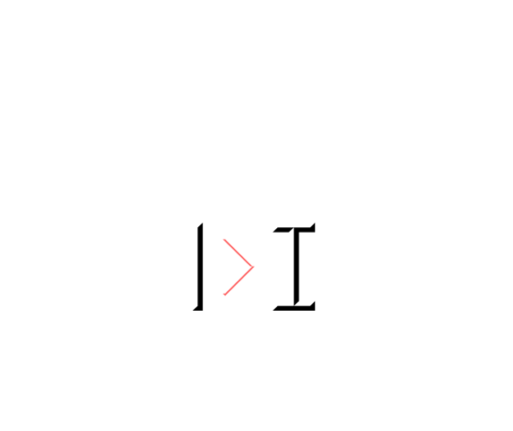 Alternate I (ss03) Alternate I letter shape. Implemented both as Stylistic Set n°3 (ss03) and Stylistic Alternate (salt) to maximize compatibility between applications. |
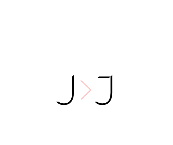 Alternate J (ss04) Alternate J letter shape. Implemented both as Stylistic Set n°4 (ss04) and Stylistic Alternate (salt) to maximize compatibility between applications. |
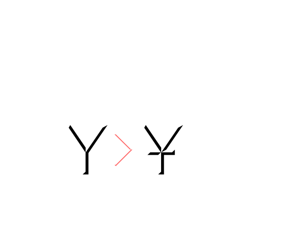 Alternate Y (ss05) Alternate Y letter shape. Implemented both as Stylistic Set n°5 (ss05) and Stylistic Alternate (salt) to maximize compatibility between applications. |
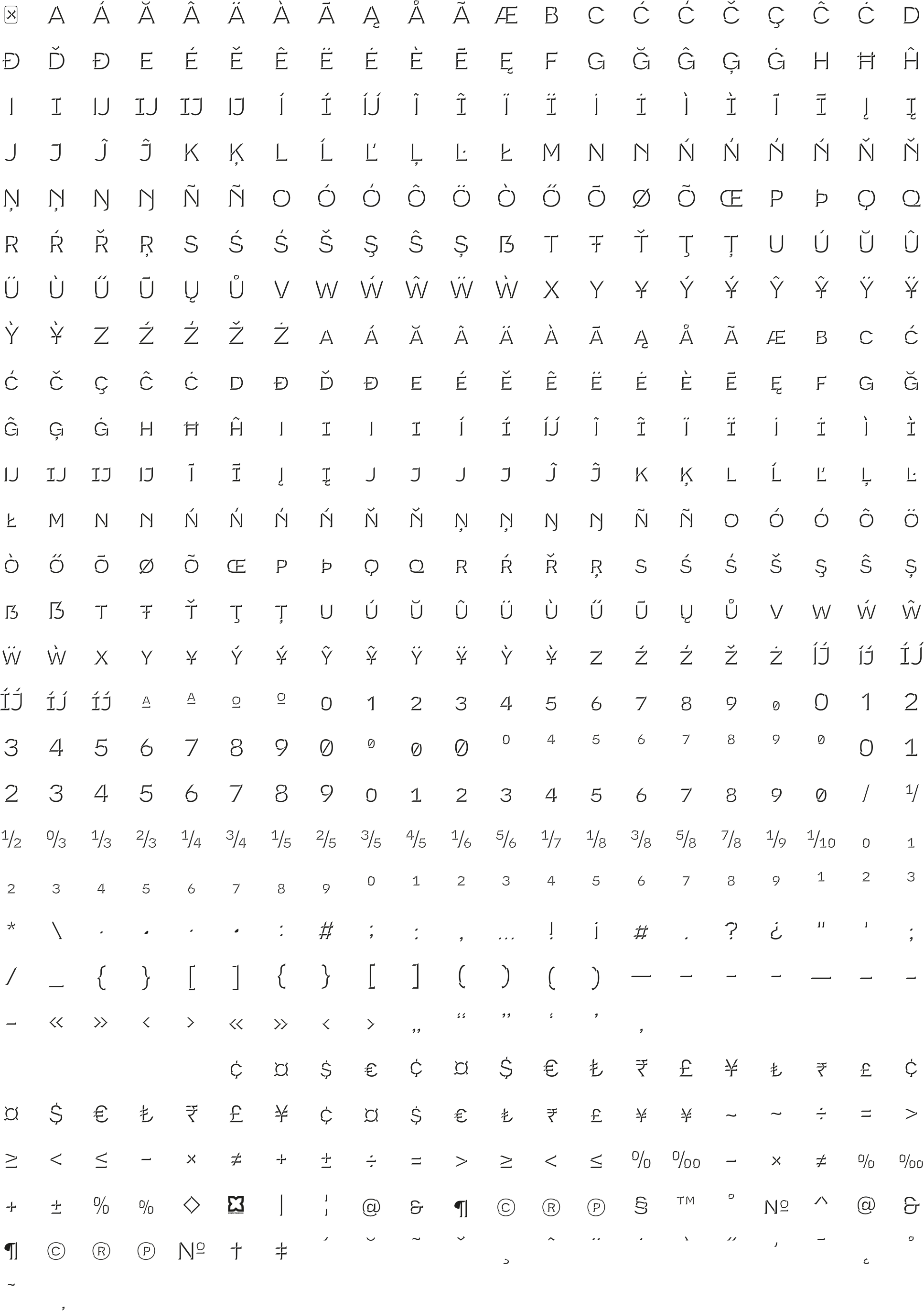
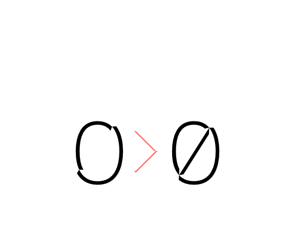 Slashed zero Slashed zero alternate glyph. Works with tabular and proportional figures, numerators, denominators and superiors. Implemented both as Zero as Salt to maximize compatibility between applications. |
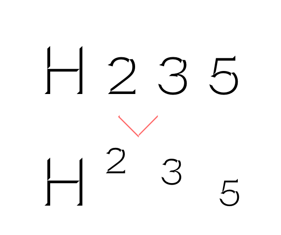 superiors numerators denominators Activates superior, numerator and denominator figures independently. |
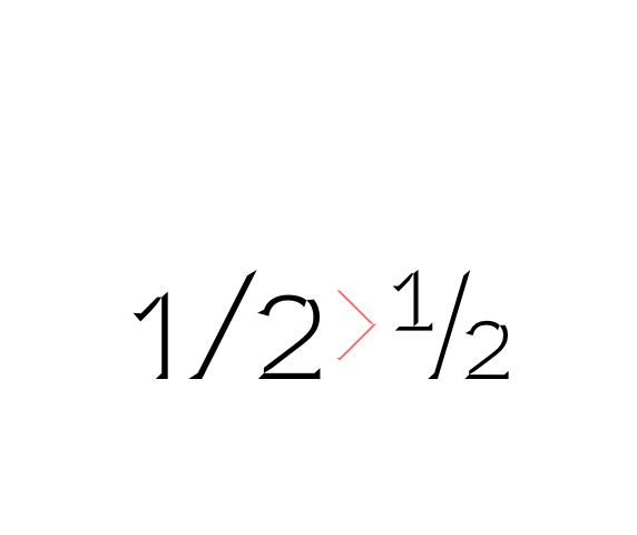 Fractions Real fractions from any [number] slash [number] sequence. |
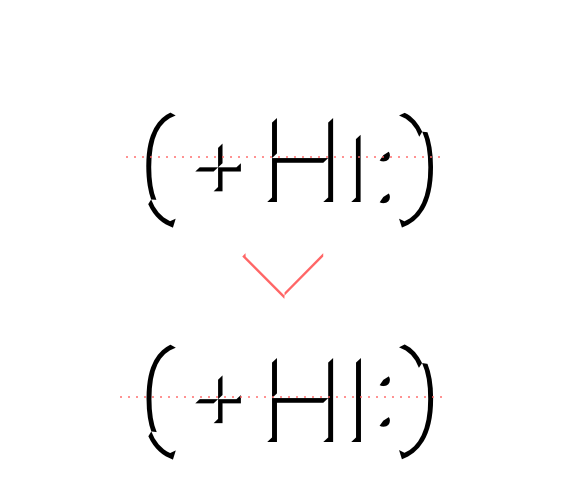 Case sensitive forms Sets All-Caps to activate case sensitive forms: transform lowercase letters, figures and the following signs to Uppercase: ª º : ; · • # ( ) { } [ ] - – — « » ‹ › + − × ÷ = ≠ > < ≥ ≤ ± ~ @ & ¶ © ® ℗ №. |
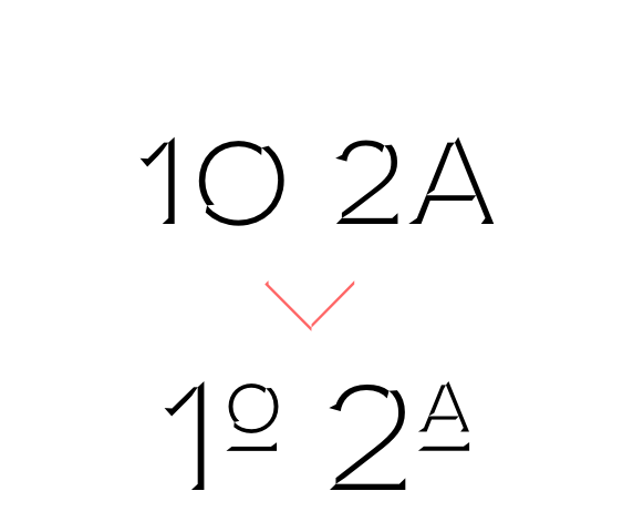 Ordinals Transforms A or a into ª and O or o into º when following a number. |
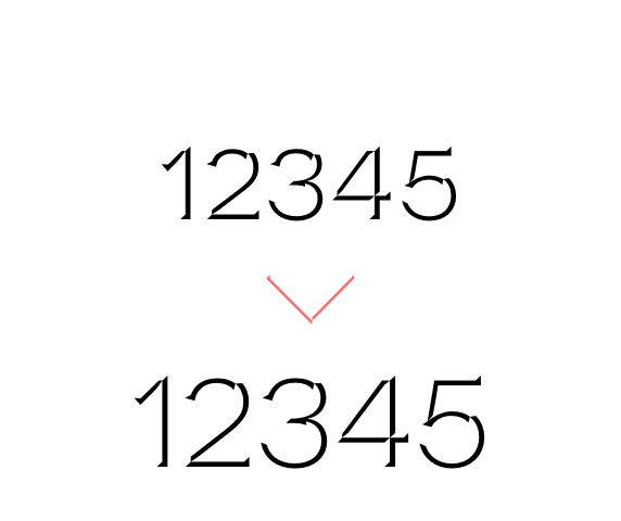 Lining & oldstyle figures Lining figures: displays uppercase-aligned variants of figures and of the following glyphs: ª º : ; · • # ( ) { } [ ] - – — « » ‹ › + − × ÷ = ≠ > < ≥ ≤ ± ~ @ & ¶ © ® ℗ №
Oldstyle figures: displays lowercas (default) figures and glyphs. |
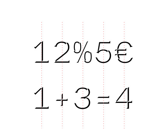 tabular figures & symbols Makes numbers, monetary and math symbols to get the same width, also across different weights. Great for table layouts. |
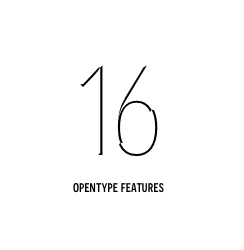
Novecento Carved uses the power of Opentype to overstep the current technical limitations, enriching the typesetting experience in a totally automated way. Just set your text language to activate the associated helpers.
 german uppercase eszett German language helper. German “Sharp S” cannot be typed on most keyboard layouts. This helper detects when an “ß” is among uppercases and transforms it into its uppercase version. This helper is associated with the “contextual alternates” OT feature and it is often activated by default. |
 turkish idotaccent Turkish language helper. It correctly differentiates capital i and dotless-i. Just set your text language to Turkish to show a dot on the capital i. |
 polish kreska Polish language helper. It allows to display the correct diacritics (kreska’s angle differs from the acute diacritic). Just set your text language as Polish to convert acute into kreska. |
 catalan punt volat Catalan language helper. It helps displaying the correct punt volant (Ldot sign) when typing the “l” letter followed by the vertically centered dot. Just set your text language to Catalan to activate the l· helper. |
 dutch double acute ij Dutch language helper. While an accented j does not exist as a glyph on its own, this helper adds an acute accent on the j (or J) when it is following and accented i (í). |
 moldavian & romanian dicritics Moldavian & Romanian language helper. It allows to display the correct diacritics. Just set your text language as Moldavian or Romanian to convert cedilla into comma-accent. |