


Standard ligatures (should be always on). It avoids collision switching f and j to shorter variants when needed. Also, it smartly switches stand-alone swashes to get the good one to combine to your glyph.

Version 1.003 — Changelog

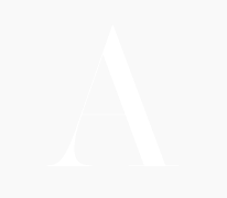
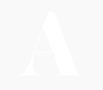
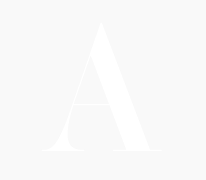
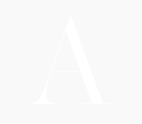
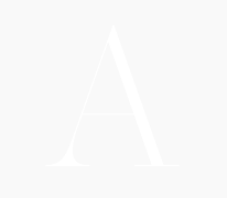
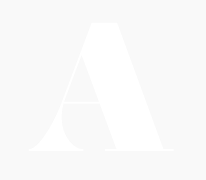
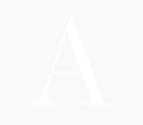
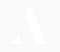
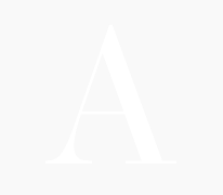
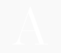
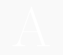
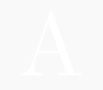
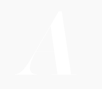
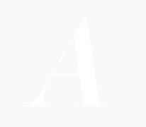
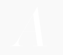
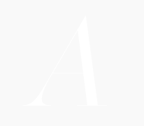
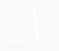
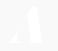
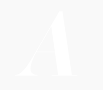
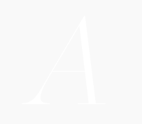
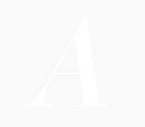
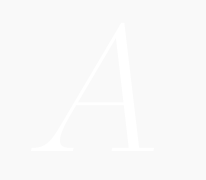
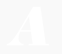
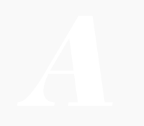
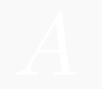
Operetta is a neo-didone display family inspired by Bodoni and Didot (late 18th century) and Walbaum (19th century). Despite this classical heritage, Operetta's design addresses contemporary typographic requirements while maintaining the refined contrast of its predecessors.
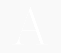
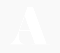
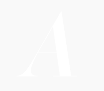
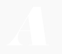
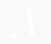
The family includes five optical sizes (8, 12, 18, 32, and 52 points), each calibrated to balance contrast and legibility across varying scales. Larger sizes exploit the defining characteristics of the didone genre—pronounced stroke contrast and delicate hairlines—while smaller sizes adopt more robust proportions to preserve clarity. This systematic approach ensures the typeface performs consistently whether set at display scale or in more modest applications.
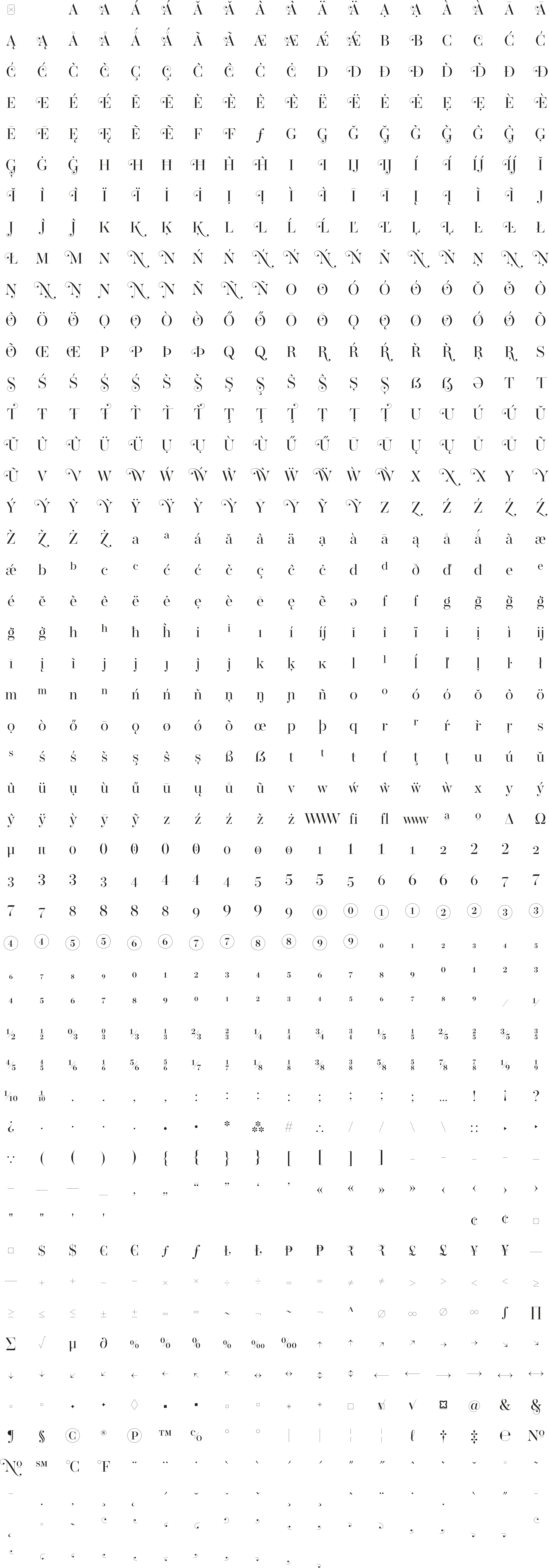
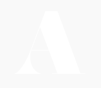
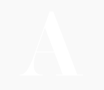
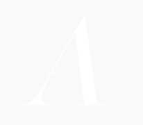
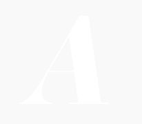
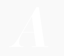
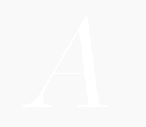
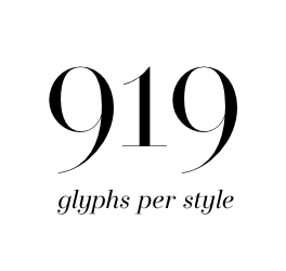
Eight weights from Extralight through to Black, each with corresponding italics, provide the tonal range required for nuanced typographic expression. The 919-glyph character set extends beyond conventional expectations for the genre, incorporating swashes, stylistic alternates, arrows, and decorative elements that expand the family's utility for editorial work, branding, and sophisticated visual communication.
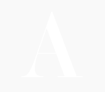
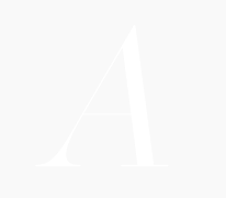
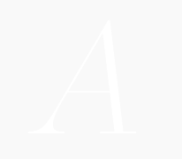
The numerical designations in the font names (8, 12, 18, 32, 52) indicate recommended minimum sizes for print use, measured in points. For screen applications, multiply these values by 1.5× for retina displays or 2× for standard 72 dpi resolution. As rendering quality depends on numerous factors—print substrate, screen technology, hinting implementation—these figures serve as initial guidance rather than absolute prescription.
Download the Operetta Specimen -->


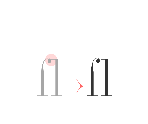 anticollision ligatures Standard ligatures (should be always on). It avoids collision switching f and j to shorter variants when needed. Also, it smartly switches stand-alone swashes to get the good one to combine to your glyph. |
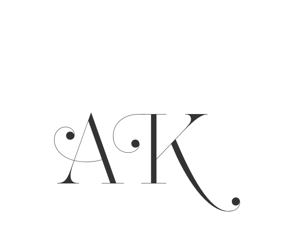 swashes Swashed alternates for all capitals letters. Smart code prevents swashes in some contexts to avoid glyph collisions. |
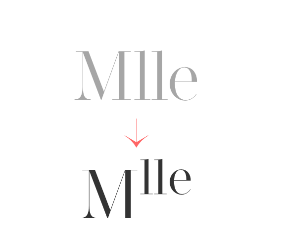
 discretionary ligatures Ligature between T and lowercases with tall stem (b, h, k, l); WWW and www ligature, activates arrows (see SS01 feature), (c) to ©, (p) to ℗, (r) to ® |
 case sensitive forms Displays a version of the glyph that matches uppercases. Case sensitive glyphs are: ß 0 1 2 3 4 5 6 7 8 9 ⓪ ① ② ③ ④ ⑤ ⑥ ⑦ ⑧ ⑨ : ; · • ◦ ‣ ◆ ■ □ ▣ ( ) { } [ ] - – — ⎯ « » ‹ › ¢ ¤ $ € ƒ ₺ ₱ ₹ £ ¥ + − × ÷ = ≠ > < ≥ ≤ ± ≈ ~ ¬ ∅ ∞ % ‰ ↑ ↗ → ↘ ↓ ↙ ← ↖ ↔ ↕ ⟵ ⟶ ⟷ |
 ordinals Creates ordinal versions for letters a b c d e h i l m n o r s t. If a or o are preceded by a figure and no letter follows, ordfeminine ª and ordmasculine º are displayed instead. |
 superscripts & subscripts Activates superscript and subscript figures independently. |
 numerators & denominators Activates numerator and denominator figures independently. |
 fractions & center-aligned fractions (ss03) Real fractions from any [number] slash [number] sequence.Stylistic set 03 “Center-aligned Fractions”. Transforms built-in fractions ½ ↉ ⅓ ⅔ ¼ ¾ ⅕ ⅖ ⅗ ⅘ ⅙ ⅚ ⅐ ⅛ ⅜ ⅝ ⅞ ⅑ ⅒ to their center-aligned variant (can be useful as it takes less space). |
 alternate y on italics (ss04) Italics only: displays an alternative y shape, closer to upright y letter. |
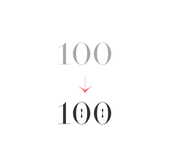 slashed zero Activates slashed-zero alternate |
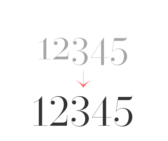 lining & oldstyle figures Lining figures: displays uppercase-aligned figures and case sensitive glyphs: ß 0 1 2 3 4 5 6 7 8 9 ⓪ ① ② ③ ④ ⑤ ⑥ ⑦ ⑧ ⑨ : ; · • ◦ ‣ ◆ ■ □ ▣ ( ) { } [ ] - – — ⎯ « » ‹ › ¢ ¤ $ € ƒ ₺ ₱ ₹ £ ¥ + − × ÷ = ≠ > < ≥ ≤ ± ≈ ~ ¬ ∅ ∞ % ‰ ↑ ↗ → ↘ ↓ ↙ ← ↖ ↔ ↕ ⟵ ⟶ ⟷ Oldstyle figures: displays lowercas (default) figures and glyphs. |
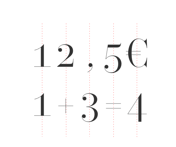 tabular figures & symbols Switches figures and some related glyphs to tabular ones. This feature makes the target glyphs same width and aligns them vertically as they were inside a table. Tabular glyphs are: π … # _ ⎯ ¢ $ € ƒ ₺ ₱ ₹ £ ¥ + − × ÷ = ≠ > < ≥ ≤ ± ≈ ~ ¬ ∅ ∞ ∫ √ µ ∂ ↑ ↗ → ↘ ↓ ↙ ← ↖ ↔ ↕ ◊ ☐ ☑ ✓ Glyphs with tabular alternates: 0 1 2 3 4 5 6 7 8 9 . , : ; · " ' ° | ¦ % / \ - (and space). Most of them have case-sensitive alternates too. In this font you’ll also find 3 long arrows ⟵ ⟶ ⟷ with their case sensitive alternate. Their length is exactly twice a tabular. |
 contextual alternates Transforms the x letter to the multiply sign (×) when between two figures and/or an extra space. |
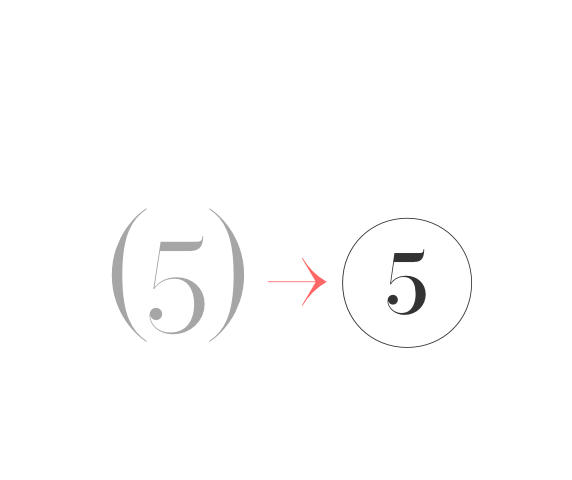 circled numbers (ss02) Stylistic set 02 “Circled numbers”. Transforms (0) (1) (2) (3) (4) (5) (6) (7) (8) (9) to ⓪ ① ② ③ ④ ⑤ ⑥ ⑦ ⑧ ⑨ |
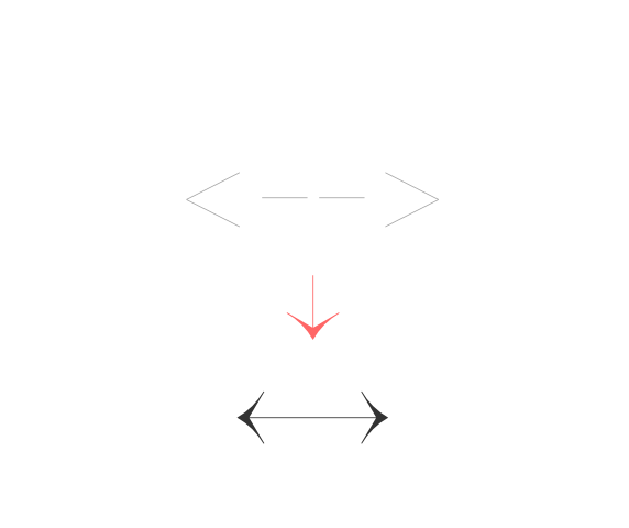 arrows (ss01) Stylistic set 01 “Arrows”. Transforms: -> to →, <- to ←, --> to ⟶, <-- to ⟵, <-> to ↔, <--> to ⟷, ^- to ↑, -^ to ↓, ^-^ to ↕, /> to ↗, </ to ↙, \> to ↘, <\ to ↖, -- to ⎯ (double hyphen makes a longer arrow, sizing exactly 2 tabular spaces). |
Create the swash combination you need by chosing swash capitals and/or stand-alone combining swashes. You can even attach some swashes between them. Please notice swashes feature is coded to avoid collisions. For instance, N and X loose their rightside swash when followed by a glyph descending under the baseline.
You can find the combining swashes at the bottom of the Glyphs panel in your graphic design software, such as Adobe Illustrator, InDesign, or Photoshop.
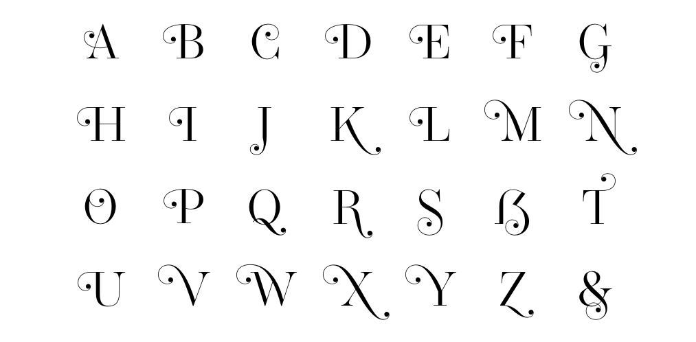

uppercase combining swashes

lowercase combining swashes

examples
Operetta is a didone with the corporate world in mind.

Operetta is a didone with the typesetting world in mind.

Operetta is a didone with the digital world in mind.

Operetta uses the power of Opentype to overstep the current technical limitations, enriching the typesetting experience in a totally automated way. Just set your text language to activate the associated helpers.
 german uppercase eszett German language helper. German “Sharp S” cannot be typed on most keyboard layouts. This helper detects when an “ß” is among uppercases and transforms it into its uppercase version. This helper is associated with the “contextual alternates” OT feature and it is often activated by default. |
 turkish idotaccent Turkish language helper. It correctly differentiates capital i and dotless-i. Just set your text language to Turkish to show a dot on the capital i. |
 polish kreska Polish language helper. It allows to display the correct diacritics (kreska’s angle differs from the acute diacritic). Just set your text language as Polish to convert acute into kreska. |
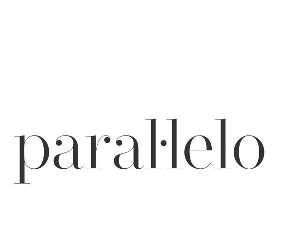 catalan punt volat Catalan language helper. It helps displaying the correct punt volant (Ldot sign) when typing the “l” letter followed by the vertically centered dot. Just set your text language to Catalan to activate the l· helper. |
 dutch double acute ij Dutch language helper. While an accented j does not exist as a glyph on its own, this helper adds an acute accent on the j (or J) when it is following and accented i (í). |
 moldavian & romanian dicritics Moldavian & Romanian language helper. It allows to display the correct diacritics. Just set your text language as Moldavian or Romanian to convert cedilla into comma-accent. |
 ideal spacing in french French language helper. Automatic (France only) French typesetting optimisation by switching common “white space” with narrownbspace (narrow non-breaking space) after * » : ; ! % ‰ and before « * Just set your text language as France-French to activate this feature. Note: this OT feature affects only the standard space sign (space bar) and doesn’t prevent from applying any other separator. |
 combining diacritics Combining diacritics you can put one upon another. Read more here https://glyphsapp.com/tutorials/mark-attachment |